A self-initiated concept brand, built from scratch to demonstrate a complete identity system: a fast grilled-food spot competing among dozens of nearly identical places, needing to be recognized before you read the name. No client involved — the brief, the strategy and every piece are mine.
THE REAL PROBLEM
Fueggo doesn't exist as a business: it's a realistic scenario I set myself as a brief. The starting point: a clear product — charcoal-grilled burgers, with that flavor only direct fire gives — and no visual face. No logo, no palette, no system.
In fast grilled food, customers decide in seconds between nearly identical options. That's the problem this system solves: instant recognition.
The brief wasn't "make a nice logo". It was translating the product concept — fire, charcoal, intensity, speed — into a visual system that worked equally well on a uniform, a packaging box, and a storefront, and that any print vendor could apply without losing consistency.
THE DECISION
I didn't design a logo and then "apply it" to everything else. I started backwards: what does someone need to feel when they see a Fueggo box in hand, or the uniform of the person delivering their order? The answer — fire, character, speed — drove every decision: the typeface had to look sharp and fast, the palette had to evoke grill and charcoal without falling into the generic red-yellow of "fast food", and the symbol had to work as small as a sticker and as large as a storefront.
That discipline is the difference between a logo that looks good on screen and a brand system that survives the print shop, the sun, daily use, and whoever applies it without supervision.
THE HARD PART
Anyone can deliver a logo as a PNG. What actually protects a brand is that logo working just as well on a multi-meter storefront as on a three-centimeter sticker, on textured cardboard or printed on uniform fabric — without anyone needing to "fix it" every time.
That meant building logo variants for different backgrounds and sizes, defining a palette with clear hierarchy (not just "the brand colors", but which one is background, which is accent, which is detail-only), and documenting everything in brand guidelines so any future print shop or vendor can apply it without asking me every time.
Fueggo is a concept brand I created end to end — there is no venue and no client. What you see is the complete system exactly as it would go to production: every piece resolved, documented and print-ready from day one.
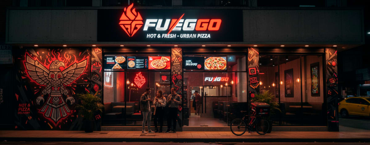 Storefront design — production ready
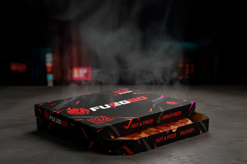 Packaging box — print-ready design
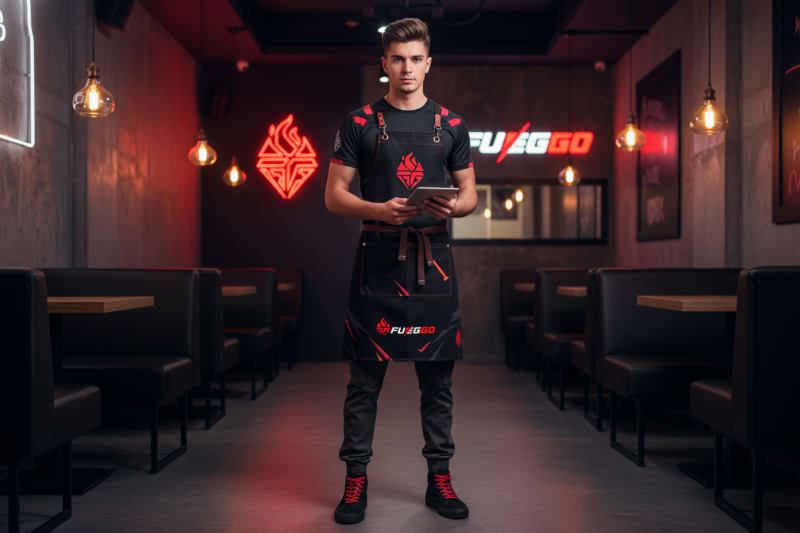 Uniform design — ready for production
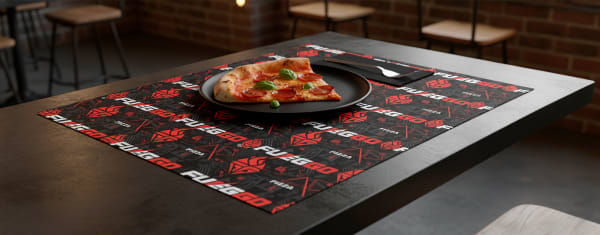 Papelería
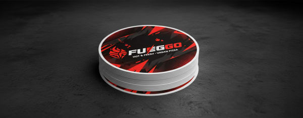 Stickers
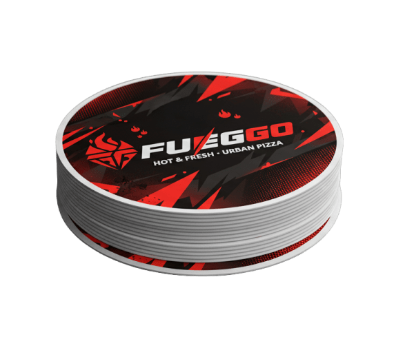 Stickers — variantes
THE OUTCOME
* Self-initiated concept with no client — so no business metrics to report. What's measurable here is the system itself: complete, documented and ready for real production.
If your product is ready but you don't have a brand system to back it up, this is exactly the problem I designed Fueggo for. The difference: your project will have a real client, real deadlines and real printed pieces. Tell me about it — I reply within 24 hours.