In an area where every nightclub changes its name but looks the same, La Jungla Club needed something no competitor could copy overnight. I built the complete identity system — logo, storefront, menu, uniforms, and flyers — so the brand is recognized before anyone walks through the door.
THE REAL PROBLEM
In most nightclubs in the area, the identity ends at the name. The sign changes, the flyer logo changes — but the experience, the colors, and the feeling of walking in are interchangeable from one venue to the next. For someone going out on a Friday, they all blur together.
The client already had something no competitor had: a name with character — La Jungla. What was missing was a visual system capable of honoring that name.
The brief wasn't "make a nice nightclub logo". It was building an identity that translated the concept — jungle, night, intensity — to every surface the brand would appear on: storefront, menu, uniform, event flyer. Something people remembered before they'd ever danced there, not after.
THE DECISION
The client arrived with the right idea: a nightclub where jungle meets reggaeton. My job wasn't to invent the concept from scratch — it was to turn that idea into a visual system that holds up on any surface without losing intensity or coherence.
We built something that goes beyond the logo: each resident DJ has their own identity within the brand's universe. It's not a decorative detail — it's a narrative structure that gives La Jungla Club something almost no nightclub in the area has: a visual world of its own, one that can grow with every new event without losing its core.
That decision — thinking in systems, not in standalone pieces — is what separates an identity that dissolves in six months from one that's still recognizable a year later.
THE HARD PART
Jungle, night, and intensity work well in an illustration. The real challenge is making that same concept look equally strong printed on vinyl across a multi-meter storefront, embroidered or stamped on uniform fabric, on menu paper under nightclub lighting, and on a flyer competing for attention in a feed saturated with Friday events.
Every surface imposes its own constraints — color, legibility, durability. Designing a system that respected those constraints without diluting the identity on any of them, and without each new piece looking like it came from a different brand, was the real work behind this project.
Every piece is designed for the surface it lives on: the storefront has to stop someone on the street, the uniform has to survive a full shift, the menu has to be readable under low light, and the flyer has to win the scroll in under a second.
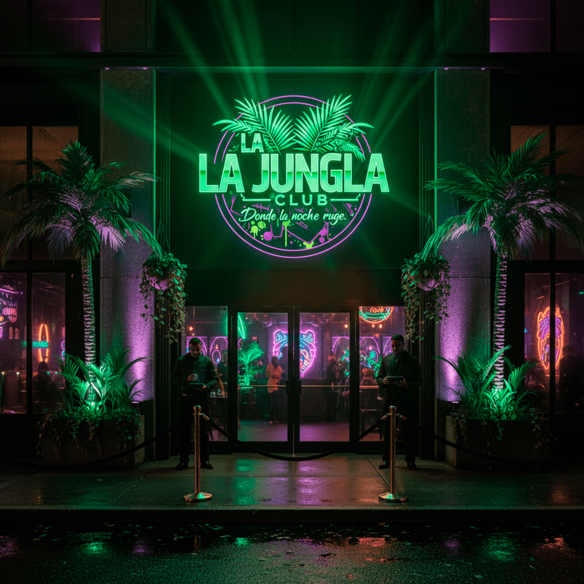 Storefront — the first impression, the one that decides if someone walks in
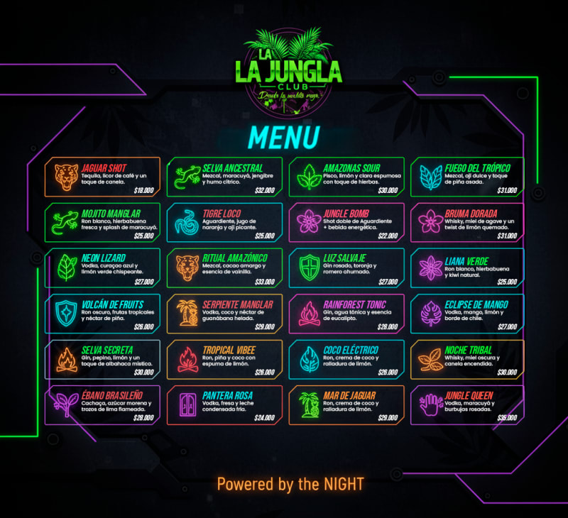 Menu — the brand stays present at every table
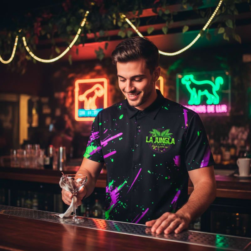 Uniform — the team as a visible part of the concept
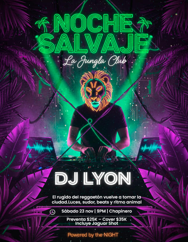 Flyer de evento
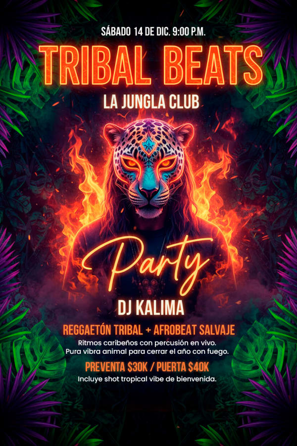 Flyer de evento
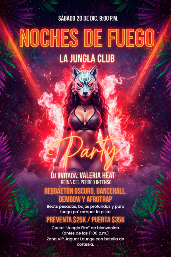 Flyer de evento
THE RESULT
* Qualitative result, based on visual differentiation achieved against direct local competitors. Attendance and conversion metrics were not part of this project's scope.
If your business looks the same as the one next door and only the sign changes, that's not a budget problem — it's a system problem. Tell me about your project. I reply within 24 hours.