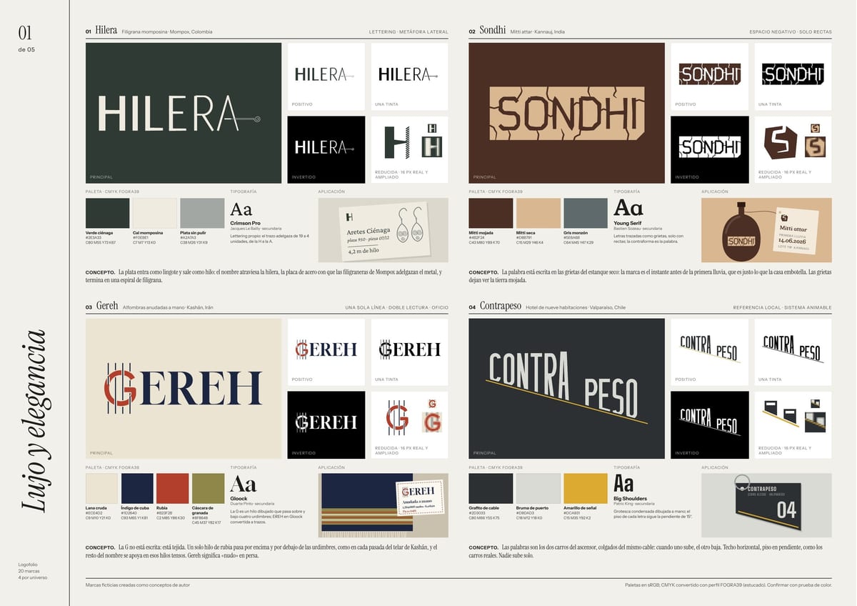
Luxury
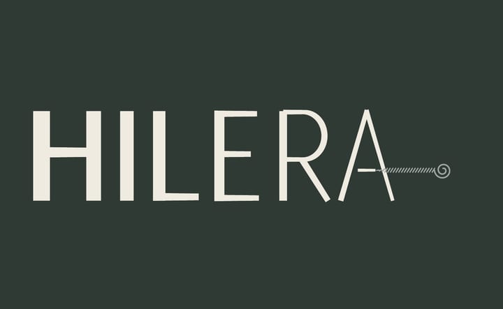
The name runs through the draw plate filigree makers use to thin silver into wire.
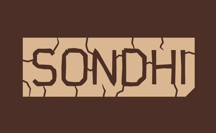
The word is written in the cracks of a dry pond: the moment before the first rain, which is what the house bottles.
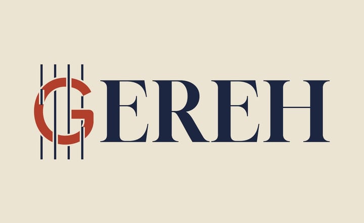
The G isn't written, it's woven: a single thread goes over and under the warp, like on the loom.
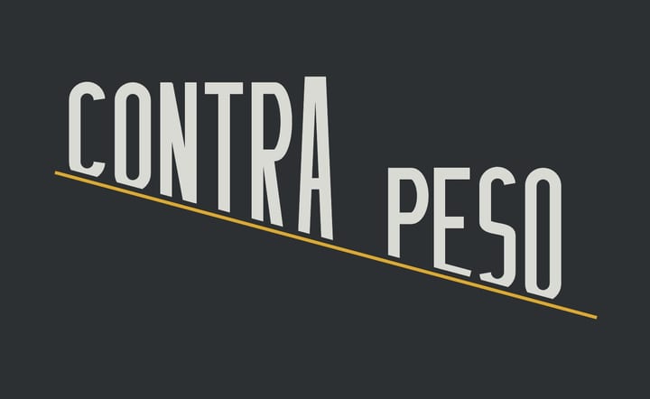
The two words are the funicular cars on one cable: when one goes up, the other comes down.
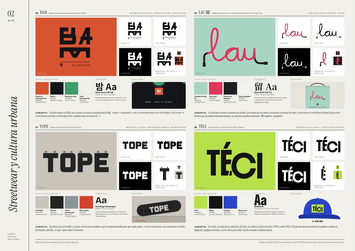
Streetwear and urban culture
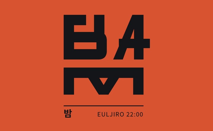
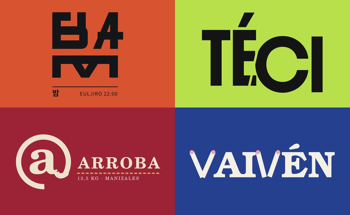
A Latin reader sees BAM; a Korean reader sees 밤, “night”, built as a single syllable block.
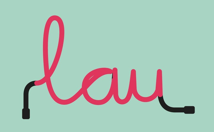
A single neon tube writes the whole name; the stretches that shouldn't glow are painted black.
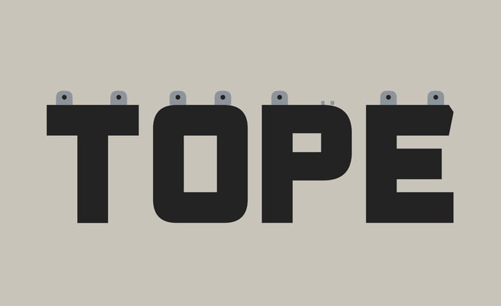
The letters are a curb with the skate stoppers the city bolts on. One has been ripped off.
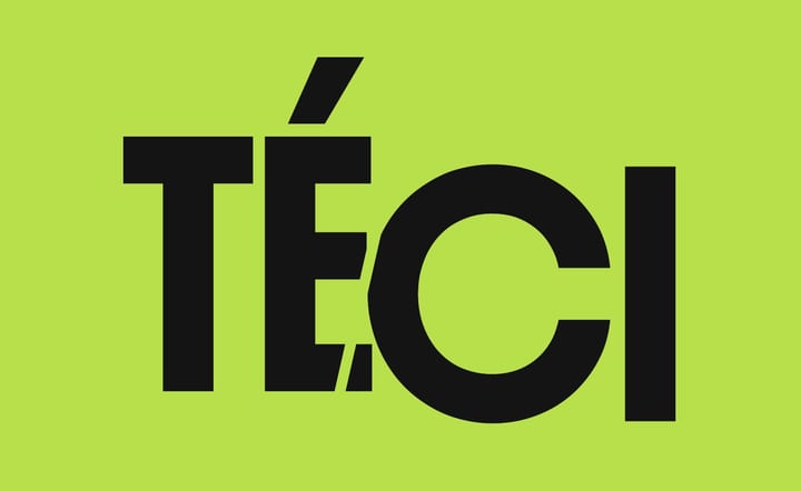
In verlan, syllables are flipped: CITÉ becomes TÉCI. The logo shows the cut.
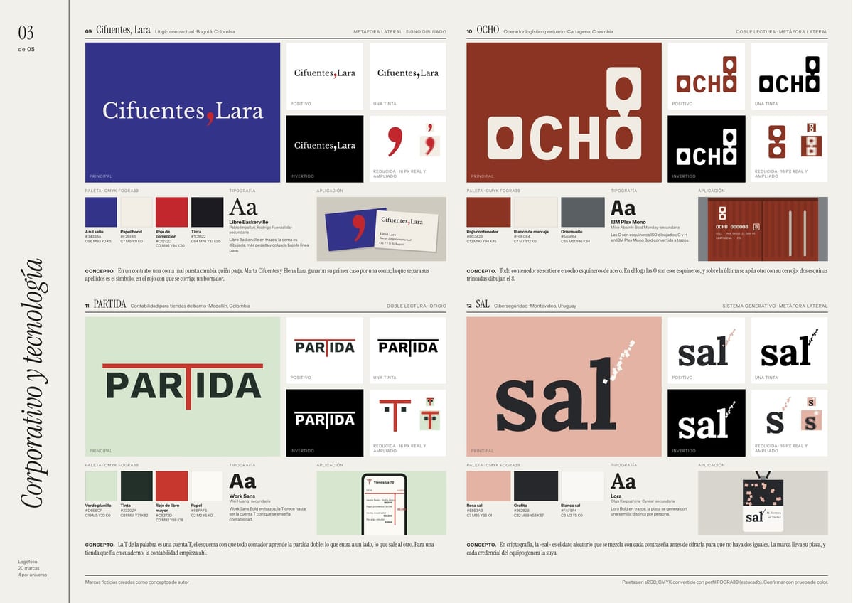
Corporate and tech
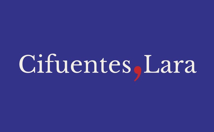
The partners won their first case over a comma; the one between their surnames is the firm's signature.
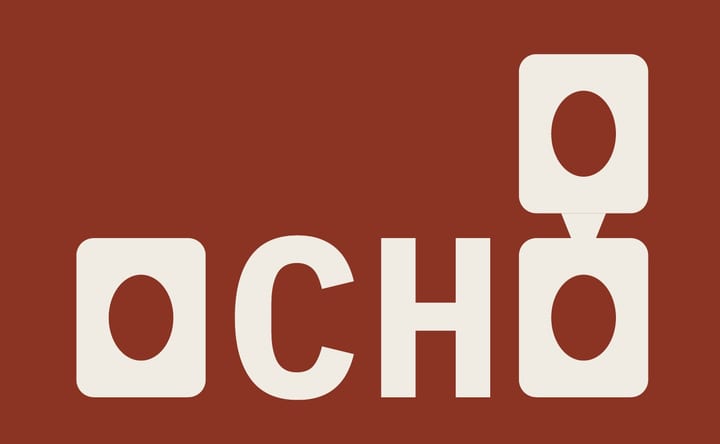
Every container rests on eight steel corner castings. In the logo, the Os are those corners.
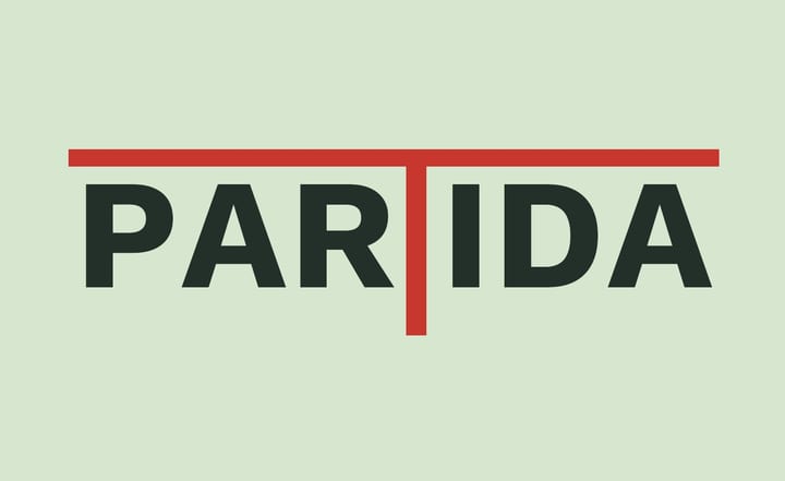
The T is a T-account, the diagram every accountant learns double-entry with.
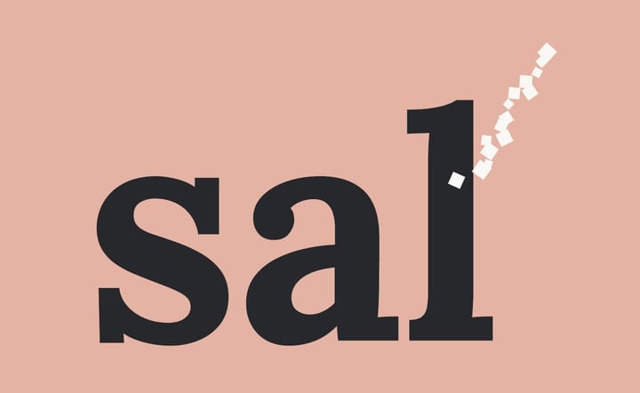
In cryptography, salt is the random data mixed into each password. The brand gets its pinch.
Food and drink
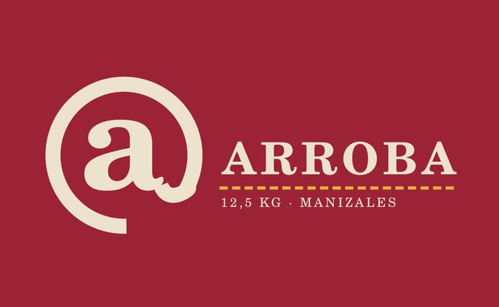
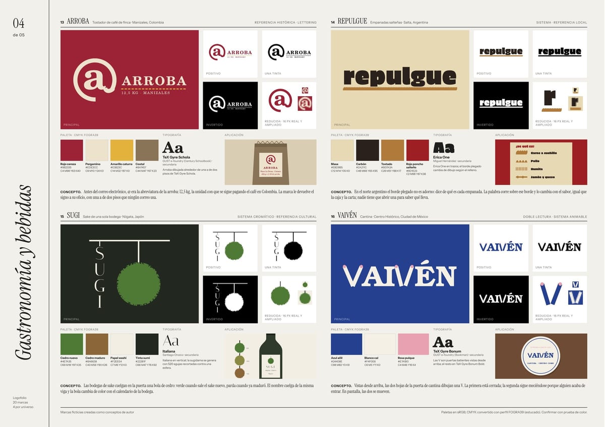
Before email, @ stood for the arroba: 12.5 kg, the unit coffee is still paid in across Colombia.
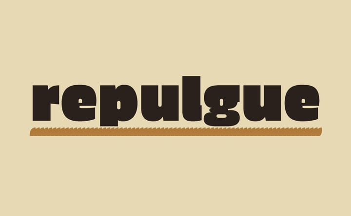
In northern Argentina, the crimped edge tells you each empanada's filling. The word runs along that edge.
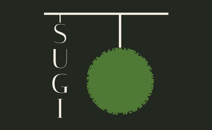
Breweries hang a cedar ball: green when the new sake is out, brown once it has matured.
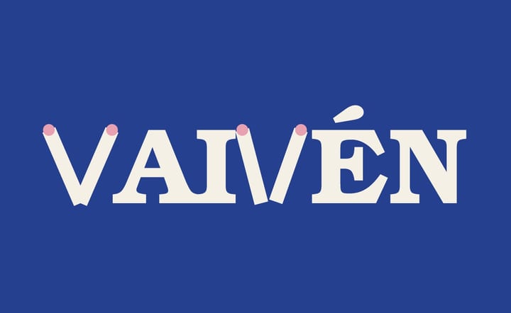
From above, swinging cantina doors draw a V; the second one is still moving because someone just walked in.
Health, sport and mobility
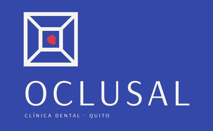
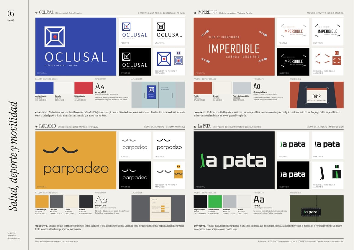
No teeth, no smiles: the dental chart cell with its five surfaces, the occlusal one marked in the middle.
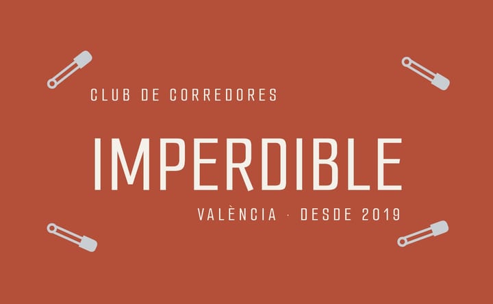
The race bib isn't drawn: four crooked safety pins hold it up, the way everyone pins one on.
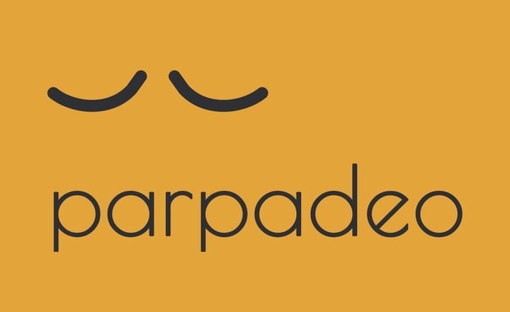
When a cat slowly closes its eyes at someone, it's saying it trusts them. The clinic signs with that gesture.
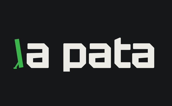
From behind, a parked motorcycle is a slanted line resting on its kickstand. The l does the same.
Each brand, as a system
No brand stops at the logo: each one has positive, one-color, inverted and 16 px versions, a palette with CMYK values, typography and a real application.
Credits
Concept, naming and design: Alexander Caro.
Every brand is fictional, created as an author concept. None of them is a real business.
Does your brand need a system like this?
Tell me where your project stands. I reply within 24 hours, in writing, with a clear proposal.