THE PROOF
From "Failed" to "Passed" in one month.
This isn't my opinion — it's Google's own Core Web Vitals report. In one month the site went from "Failed" to "Passed", and PageSpeed climbed from 40 to 97. In practice: 14 seconds of load time turned into a near-instant open.
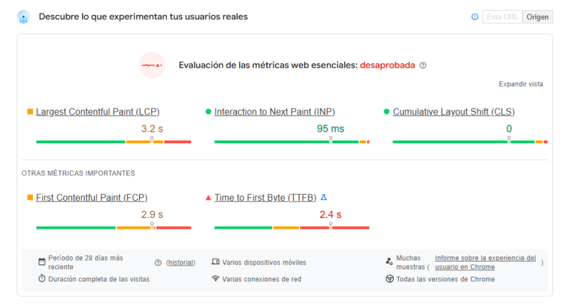
Before
40 — Failed
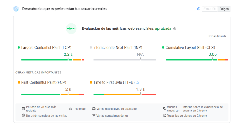
After
97 — Passed
VS