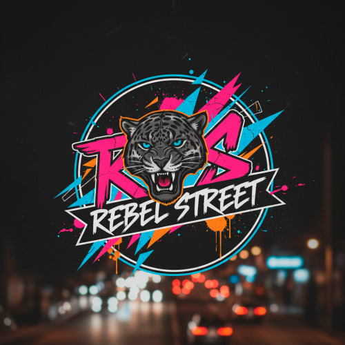
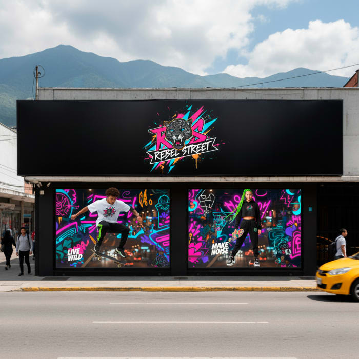
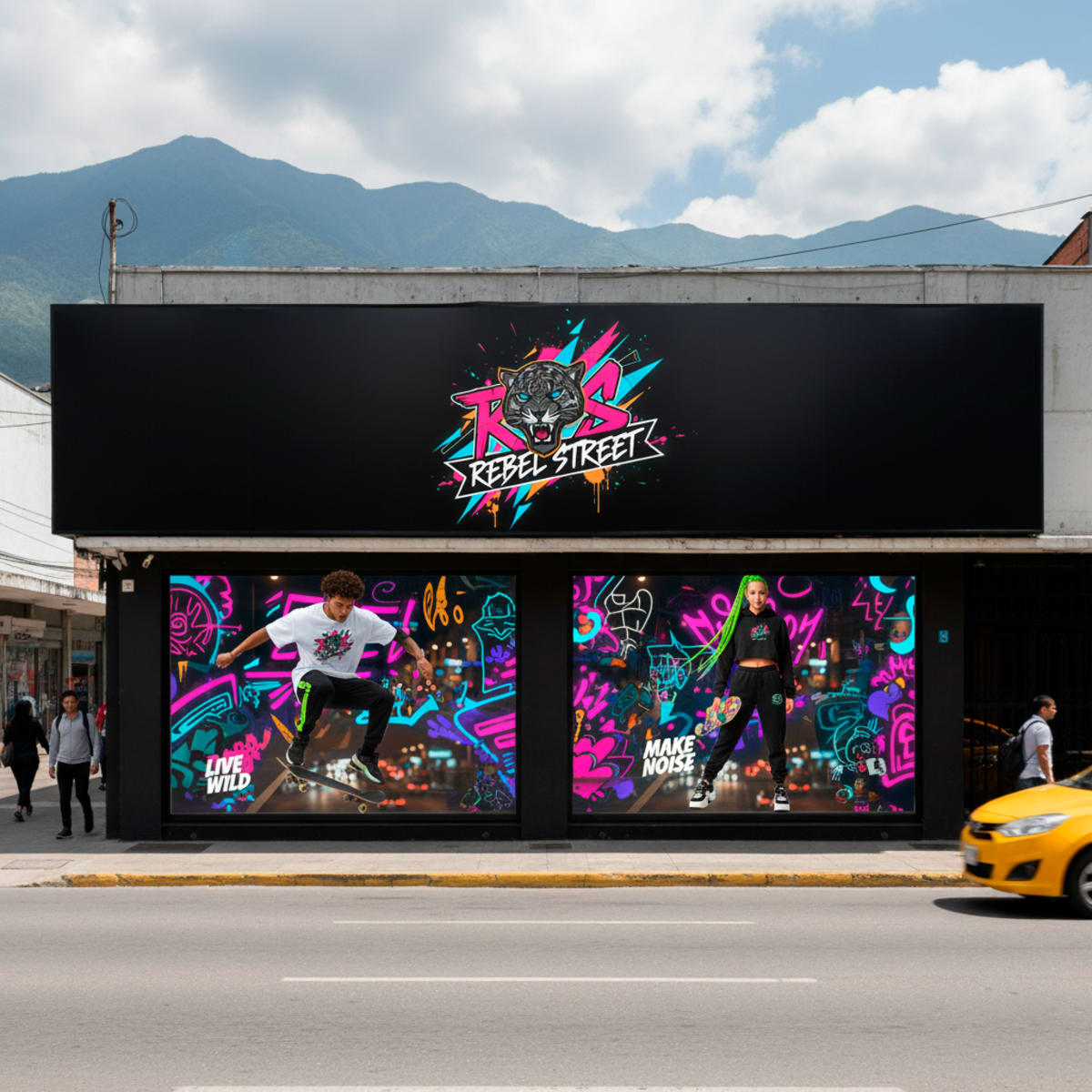
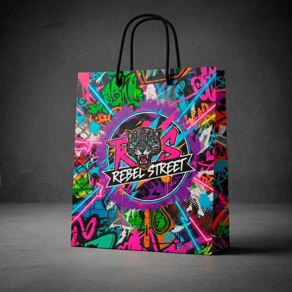
A clothing brand doesn't just sell garments — it sells a face. Rebel Street arrived with a logo made in Canva and an idea without a system. What's going on the street is this.
THE REAL PROBLEM
Rebel Street was an independent entrepreneur's first own brand. No store, no production yet — just an idea and a logo put together in Canva with AI assistance. Good enough to show a friend. Not good enough to put on a storefront, a clothing tag, or the back of a hoodie someone is going to wear in public.
In urban fashion, nobody buys the garment first — they buy the identity. If that identity looks improvised, the garment feels improvised, regardless of the fabric quality.
The brief wasn't "improve the logo". It was building, from scratch, everything a brand needs to exist coherently before its first sale: a visual system with street credibility — graffiti-influenced, with attitude — but with the discipline to survive applied on storefronts, garments, tags, packaging, and uniforms without falling apart.
THE STARTING POINT
This is the real contrast: what existed when the brief arrived, versus the final system already applied. This wasn't a typography tweak — it was building from the ground up what was missing: hierarchy, consistency, and a graphic sensibility that holds up on any surface.
THE HARD PART
Anyone can drop a spray font and call it "streetwear". The real challenge is different: designing a system with enough street attitude for the right audience to recognize it instantly, but with enough discipline for the same brand to look just as solid on a 4-meter storefront as on a 3-centimeter tag.
That meant defining rules before designing pieces: which graphic elements repeat, how the logo behaves at different scales, which palette stays fixed and where there's room to vary. Without that framework, a "street" system falls apart by the third application — you can see exactly where the rule ended and the improvisation began.
THE SYSTEM IN ACTION
The value of a brand system isn't visible in one piece — it's visible in the tenth piece still feeling like it belongs to the same brand as the first. This is that proof.
Storefront application — the first impression, at real scale
Hoodie
Jogger
Camisa oversize
Staff uniforms — the brand is also worn by the people who serve
Brand pattern — the graphic element that repeats and anchors everything else
Tag — the brand confirmed in the smallest detail
Packaging bag — the brand experience starts before the garment is opened
Thank-you card
THE RESULT
Rebel Street went from a practice logo to a complete visual system: 9 pieces applied with the same graphic identity, none of them feeling like the weak link. It's the brand foundation any fashion project needs before its first sale — and proof that I can take a street identity from concept to physical application without losing coherence along the way.
[REAL DATA: if Rebel Street started selling, launched on social media, or if the client came back for a second phase — let me know and I'll turn it into a real metric or quote here. Without that data, this section stays with what I can actually prove: the system delivered.]
Si tu logo salió de una herramienta de IA "para empezar" y nunca se actualizó, tu marca probablemente sigue contando esa historia — aunque el producto ya esté listo. Cuéntame qué estás construyendo y te digo qué necesita tu identidad para sostenerse cuando la gente empiece a verla en serio.