The brief
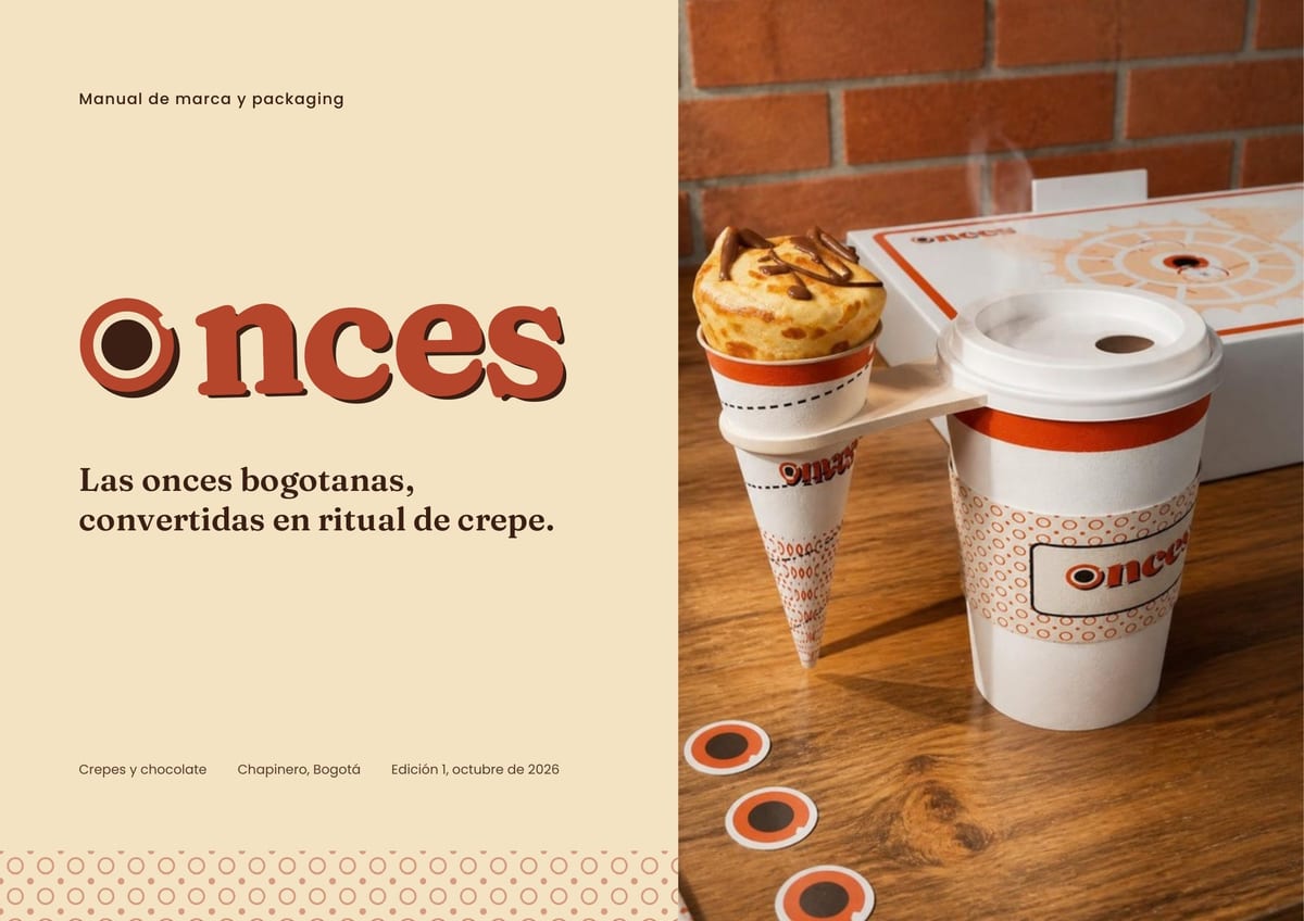
Create a sweet-and-savory crêperie for Chapinero from scratch, with packaging people want to photograph, share and remember.
French clichés were off the table (Eiffel Tower, berets, “Parisian” scripts), and so was the generic café look: kraft with a black stamp, chalkboards, stock boxes with a logo slapped on.
Before designing I asked twelve questions about audience, price, tone and operations. Weekend families come first, the kitchen makes 300+ crêpes a day, and the ask was clear: opening the package should feel like getting a gift.
The idea
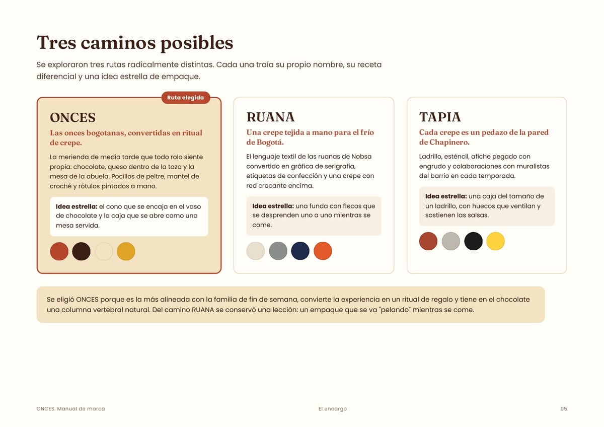
Las onces means Santafé hot chocolate, cheese melting into the cup and a carefully set table. Every Bogotá local owns the word, and no crêperie had claimed it.
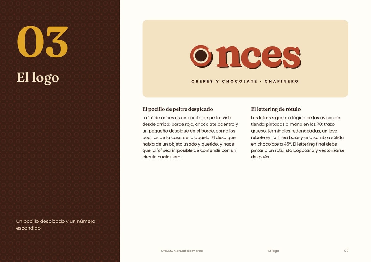
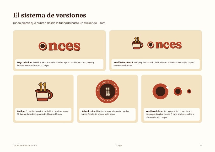
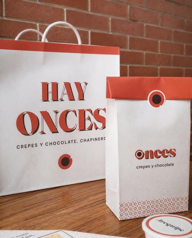
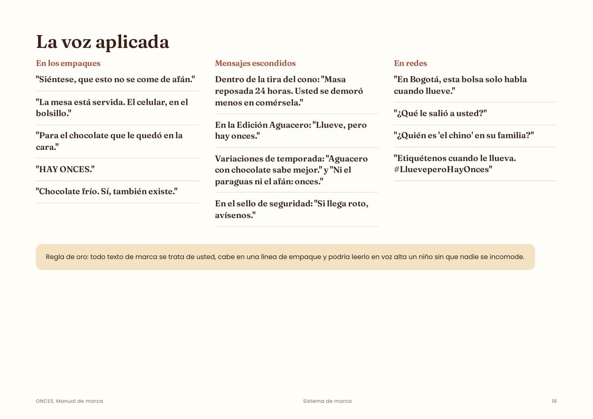
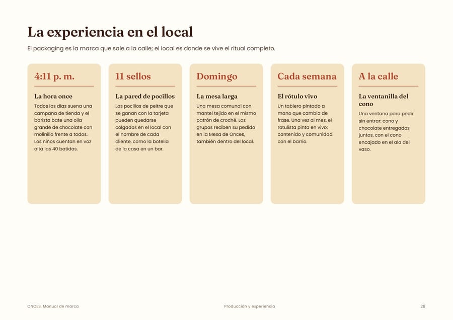
The idea takes the crêpe out of France and into a centuries-old local tradition, and it makes the house chocolate the star. And once means 11: the number hides in the icon, the 11-stamp loyalty card and the 11th of every month.
“If you didn't dip it in the chocolate, it wasn't onces.”
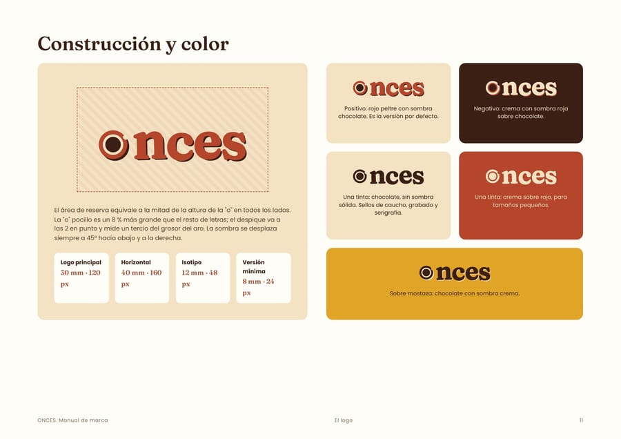
Palette and proportion of use
Cream#F3E3C345 %
Paper white#FFFDF825 %
Enamel red#B5452B18 %
Chocolate#3B1F1410 %
Mustard#E0A5262 %
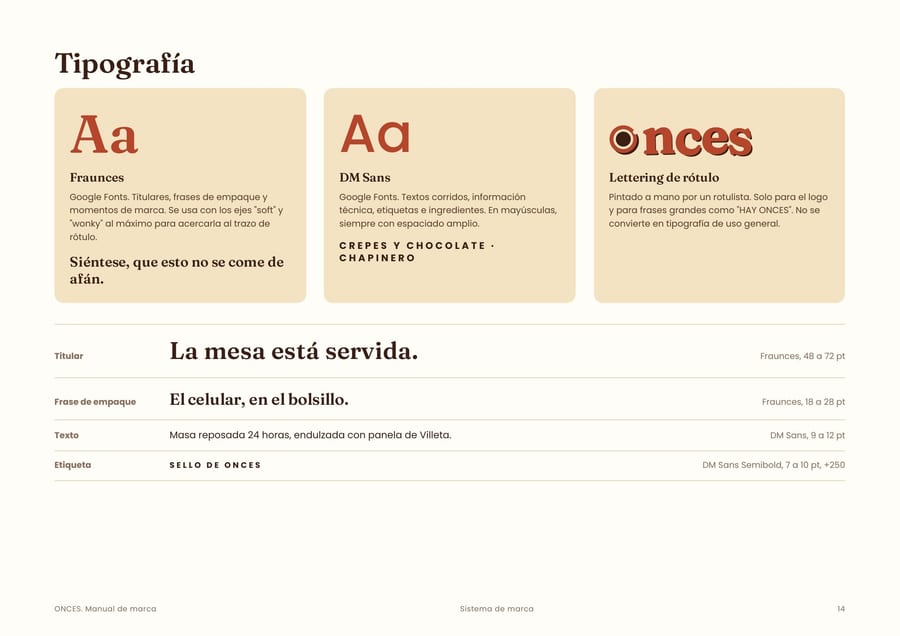
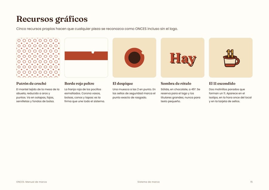
The packaging
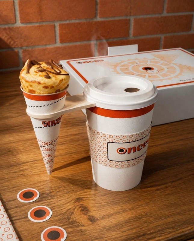
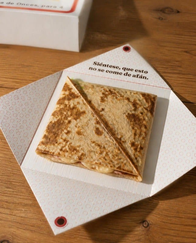
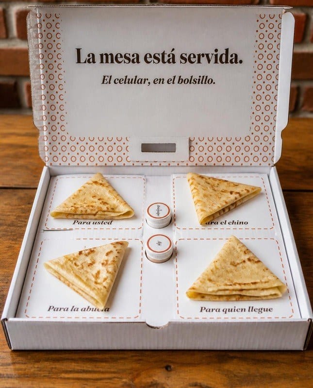
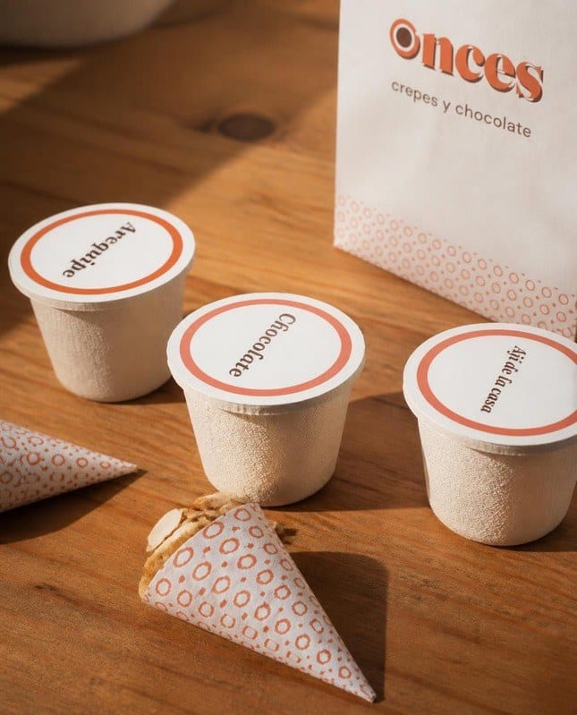
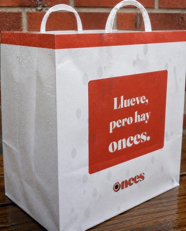
Every package has a shape, a mechanism and a reveal. Sweet crêpes come in a cone that slots into the chocolate cup, so you can eat while walking without a mess. Savory ones come in a box that opens like a set table.
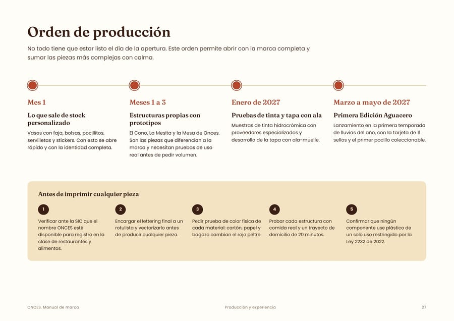
There are eight pieces, all producible in Colombia in board and paper, with a phased production plan that doesn't strain first-year cash flow.
Credits
Strategy, naming, identity, voice, packaging and manual: Alexander Caro.
Concept project: ONCES is not a real business and there was no client. Base mockup photography was generated with AI; the logo, graphics and brand system are my own design.
Does your brand need a system like this?
Tell me where your project stands. I reply within 24 hours, in writing, with a clear proposal.