What a brand guidelines manual includes and why your business needs one
A brand guidelines manual isn't a pretty PDF to file away. It's the tool that stops your logo from getting distorted, every supplier from using different colors and your brand from looking improvised. Here's what it should include, section by section.
A brand guidelines manual is the document that gathers the rules of your visual identity: how the logo is used, which colors go where and in what proportion, which typefaces you use, how the brand sounds when it speaks and how it looks on real pieces. Its job is simple and very valuable: anyone, whether a printer, a new designer or your social media team, can use your brand without distorting it.
Many businesses see it as a luxury for big companies. It's actually the other way around: a small business is the one that can least afford the mess of redoing pieces, reprinting packaging or explaining the same thing to every supplier. In this article I explain what a brand guidelines manual includes, section by section, with examples from two systems I designed: ONCES and Fueggo.
What brand guidelines are (and what they aren't)
A brand guidelines manual, also called a brand book or identity manual, is not a logo presentation. Showing the logo on a nice background is a moodboard. The manual tells you how to use it, when to use each version, how not to use it and what to do in tricky cases.
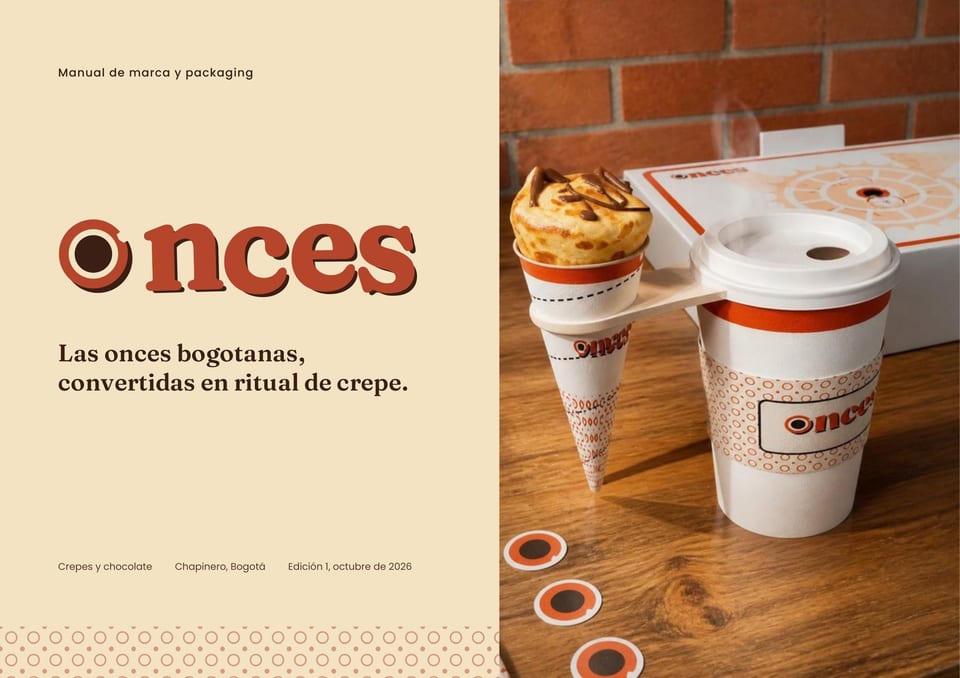
It isn't a strategy document hundreds of pages long, either. For most businesses, a clear 20- to 40-page manual covers everything that's needed. The one for ONCES, a Bogotá crêperie I designed as a concept project, has 32 pages and includes the full brand and eight packaging pieces.
Signs your business needs brand guidelines
- Your logo looks different on your sign, on Instagram and on your invoices.
- Every time you send something to print, you have to hunt for "the right file" of the logo.
- You changed designers and the new pieces don't look like the old ones.
- Your team uses "similar" colors because nobody knows the official ones.
- You're opening another location, launching a product or making packaging, and you want everything to look like the same brand.
If two or more of these sound familiar, guidelines will save you time and money from the very first order.
The sections of a brand guidelines manual
1. Logo, versions and construction
This is the foundation. Serious brand guidelines don't deliver a single logo: they deliver a family of versions designed for every situation. ONCES has five, from the storefront down to an 8 mm sticker. For Fueggo I designed variants by background and by size, because the logo had to live on a cardboard box, on uniform fabric and on a storefront several meters wide.
This section includes:
- The primary version and the alternates: horizontal, vertical, symbol only.
- The construction: the grid and proportions the logo was drawn on, so nobody redraws it by eye.
- Positive and negative versions: how it looks on light and on dark backgrounds.
- The minimum size: the point at which it stops being legible and you need to switch to the simplified version.
2. Clear space and incorrect uses
Clear space is the empty area that must always surround the logo so it can breathe. Without that rule, the logo ends up jammed against the edge of the page or covered by text. It's defined with a measurement taken from the logo itself, such as the height of one letter, so it works at any scale.
Incorrect uses show what not to do: stretching it, rotating it, changing its color, adding shadows or placing it on a photo that makes it hard to read. It seems obvious, but it's the page that prevents the most mistakes.
3. Color: palette and proportions
A palette isn't just a list of colors. What turns five colors into a brand is the proportion in which they're used. For ONCES I defined it like this:
| Color | Proportion | Use |
|---|---|---|
| Cream | 45% | Main background |
| Paper white | 25% | Secondary backgrounds and breathing room |
| Enamel red | 18% | Accent and identity elements |
| Chocolate | 10% | Text and contrast |
| Mustard | 2% | Occasional detail |
With that table, any designer understands that mustard is a detail and not a background. For Fueggo the hierarchy was just as explicit: which color is the background, which one is the accent and which one is reserved for details. This section also includes the codes for each color on screen (HEX and RGB) and in print (CMYK and, where relevant, Pantone), because a red on Instagram and a red printed on cardboard aren't achieved with the same value.
4. Typography
Here you define the type families, what each one is for and how text is organized. For ONCES: Fraunces for headlines, DM Sans for body text, and the custom lettering reserved for the logo only. That last rule is key: if the logo's lettering is used for everything, the logo stops being special.
Good guidelines also specify relative sizes, line spacing and free or system alternatives in case someone doesn't have the fonts installed.
5. Graphic assets
These are the elements that identify the brand without needing the logo: patterns, textures, illustrations, icons, borders or shapes. ONCES has five: the crochet, the enamel-red rim, the chip, the sign-painter shadow and the hidden 11. If someone sees a package from the side, with no logo in sight, they still recognize the brand.
This is the section that makes your social media, your packaging and your shop feel like one family.
6. Voice and tone
A brand also has a way of speaking. The voice section defines the tone, the words you use and the ones you avoid, and gives real examples. The ONCES voice mixes artisan facts with Bogotá humor: "Dough rested 24 hours. Longer than you on a Sunday." With an example like that, whoever writes the posts gets the tone better than with any list of adjectives.
7. Applications
This is the real test: the system on actual pieces. For Fueggo I designed the storefront, takeout box, uniform, stationery and stickers. For ONCES, eight packaging pieces that can be produced in Colombia with cardboard and paper, with a phased production order so the first year's cash flow isn't put at risk.
Applications work as examples and also as specifications: sizes, materials and finishes so the printer doesn't have to guess.
What brand guidelines most often leave out
- Extreme sizes. A logo can look perfect on screen and disappear when embroidered on a T-shirt or printed on a 3 cm label. It has to be tested big and small.
- Real materials. Kraft cardboard shifts colors, fabric absorbs ink, and a storefront is seen in daylight and at night.
- The files. Guidelines without the file folder (vectors, PNG versions, fonts and palettes) mean you have to ask for everything again.
- Who will use it. The manual should be written for the printer and for your team, not just for designers.
Brand guidelines, logo and identity system: the difference
A logo is one piece. An identity system is the set of logo, color, typography, assets and voice that make the brand recognizable. The brand guidelines manual is the document that explains that system so it's always applied the same way. If all you have is a logo, there isn't much for a manual to organize. I go into more detail in Canva logo vs. brand system.
What it costs not to have brand guidelines
The cost doesn't show up on an invoice, but you pay it: hours spent looking for files, pieces redone, packaging reprinted because the color came out wrong, and a brand customers never quite recognize. Every time a supplier "interprets" your brand, they change it a little. After a year, those small differences show.
If you want an identity system with guidelines that are ready for production, take a look at my visual identity service. I deliver the complete system, the manual and the files so any supplier can apply it without calling you.
Frequently asked questions
What is a brand guidelines manual?
It's the document that gathers the rules of a visual identity, such as logo versions, clear space, colors and their proportions, typography, graphic assets, voice and applications, so anyone can use the brand without distorting it.
How many pages should brand guidelines have?
For most businesses, 20 to 40 pages is enough. What matters isn't the page count but covering the logo and its versions, color, typography, graphic assets, voice and real application examples.
Does a small business need brand guidelines?
Yes, especially if it works with several suppliers, prints packaging or has someone else running social media. Guidelines prevent rework and keep the brand looking the same everywhere.
What's the difference between brand guidelines and a brand book?
In practice the terms are used interchangeably. Some people call a more inspirational document a brand book and a more technical one brand guidelines, but a good manual combines both.
Which files come with brand guidelines?
Usually the logo vectors and versions (AI, SVG or PDF), PNGs for screens, the fonts or their download links, the color codes and templates for the main applications.